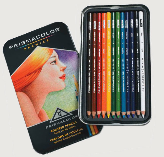
This industry-sponsored project represents a rethinking of Prismacolor's core brand, product line, and packaging. In addition, it includes a strategy designed to sustain the company as digital art grows in popularity. The final concepts were presented to C-level executives from parent company Newell Brands, as well as designers and brand managers at Prismacolor.
The Challenge
Prismacolor is one of the most iconic American art materials brands. The two most important products in the company's lineup are its colored pencils and, to a lesser extent, its markers.
Despite its success, the brand's products and packaging are beginning to show their age, and competitors like Copic are well on their way to threatening its supremacy. Further, increasing use of digital art programs and stylus interfaces threatens future sales.
Prismacolor was primarily seeking a new visual brand language for its markers, pencils, and packaging that would allow it to differentiate itself as a premium, luxury brand for serious artists. It also expressed a desire for a future roadmap that would allow the brand to innovate in the age of digital art.
Reimagining the Brand
The final logo design was based on an angular visioning of a triangular prism.
Prismacolor gains iconic symbol that will stand in for the brand even when the full logotype is not present.
The "Achieve" Campaign
To drive home the company's brand goals of hard-won achievement through serious work, I conceptualized a campaign based around the idea of seeing different visions of success when looking through the prism.
Through the prism, we see bursts of color, pencil shavings, and high-level artwork.
Products and Packaging
I defined the visual brand language on three distinct principles. First, the angled ends of the markers and pencils are inspired by the angles of drafting tables used by serious artists and designers. Second, there is a theme of a color strip running through the products, echoing the concept of color running through a prism. Third, all items have a flat facet running through, a nod to prismatic faceting.
All final designs were produced as functional, aesthetic prototypes and tested extensively for ergonomics and usability.
Markers
The marker color has the appearance of "running through" the entire object.
Current markers from Prismacolor and competitors do a poor job of identifying which side of the marker has a given nib. This concept makes it obvious both visually and tactilely, so the user's focus never breaks from the task at hand.
The Sure-grip facet anchors the marker in the hand, while the ability to move caps with one hand allows the artist to maintain flow state.
Pencils
Pencils make use of dipped, angled ends, which look enticing in an in-store display. A smaller Sure-grip faced runs the length of the pencil, and the soft-touch finish maintains comfort and control in sweaty hands.
Packaging
New packaging echoes the faceted prism logo's shape as an extrusion. This sample is a colored pencil pack. Other products would be packaged using the same concept resized for fit.
Above all, packs are designed to inspire the users. "Prismacolor Pro" sponsored artists will curate sets and create art using the included materials. This work is prominently featured on the package.
Users get to know the artist, and have the option to connect with a suite of Prismacolor digital services to get a lesson on how the artist created the piece featured on the pack. Sets are sold in mini-modules, with Pro artists curating 5 sets per season. This is "Spring Set No. 1."


